Branding and Packaging Design for Fritos Perez Popeo
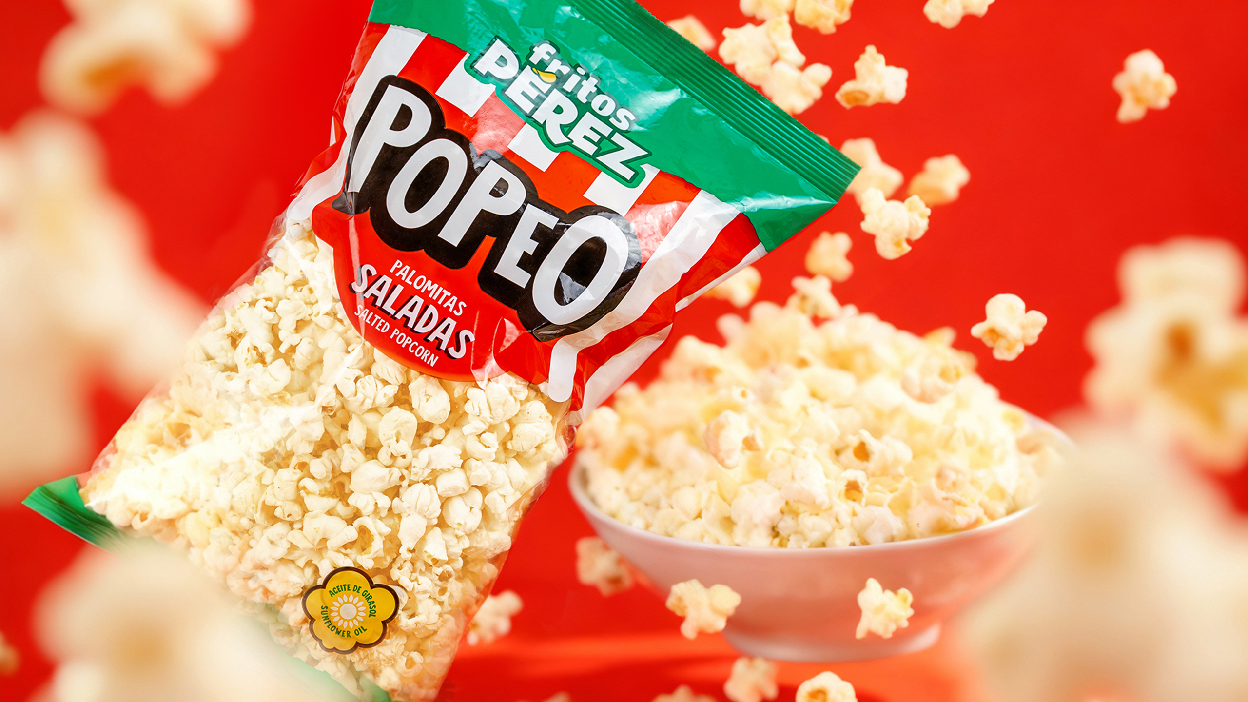
POPEO, the new range of popcorn from Fritos Pérez.
POPEO is not just popcorn. It’s the moment the movie you choose, the laughter you share… it’s the snack that pops.
At Etform, we designed the new popcorn range for Fritos Pérez — a Branding and Brand Architecture project that literally breathes pop culture.
The visual system is built from colored stripes combined with white — an eternal nod to cinema and classic popcorn.
Each flavor is distinguished by its own color code, bringing variety and clarity to the range.
Fritos Pérez’s corporate green reinforces coherence, creates visual impact on the shelf, and ensures immediate brand recognition.
The result is a proposal that aligns and connects with Fritos Pérez’s new line of potato chips, expanding its portfolio and adding visual consistency to the category.

